In statistical analysis, the numerical techniques like confidence intervals, hypothesis testing, as well as regression analysis are fundamental. These methods are built on certain assumptions of the data. Graphs are vital in the verification of these assumptions, especially when dealing with the non-numerical data like the colors, flavors, or the brand names, where the numerical measures are hard to compute. In this post, we will explore the most popular visualization tools that are used to find the answer to our research question. We will also highlight the benefits of opting buisness statistics assignment help to get assistance in visualizing big and complex data for meaningful insights.

In business statistics, the visual data presentation is much crucial. The graphical data representations not only make data easier to understand but also helps in communicating the complex information more effectively. This guide thus provides students with an overview of the top 10 graphical data representations that are essential for any business statistics assignments. Thus, mastering these visual tools will help students to enhance the quality and clarity of their statistical analyses.
Description: A bar chart is one of the simplest and most used graphical displays of data. It employs rectangular bars to compare different values. However, the length of the bar depicts the value being represented. The bars can be oriented vertically or horizontally.

Use Cases in Business Statistics: These are ideal when working with discrete categories or groups since these enable a comparison to be made easily. Companies employ them to present sales figures, marketing data and statistics, as well as people’s opinions in the form of surveys.
Example: Suppose, there is a bar chart showing a comparison of the sale of four products in the four different quarters of a year. The graph shows each bar as a product and the height shows the sales volume per quarter. This contributes to the ability to perform comparison based on product and time element.
Description: Histograms are equivalent to bar charts, but they are used to display the distribution of data set. It aggregate data into intervals or bins and provide the frequency of value for each bin.

Use Cases in Business Statistics: Histograms are very useful to illustrate frequency distributions such as the distribution of customers’ age.
Example: An assessment of customers’ age is made through age frequency distributions displayed in histograms to identify the target demographic for a given business.
Description: Pie charts is the circle that is divided into sectors in order to make a comparison of numbers in proportion. They are like sections of a pie where each slice presents the percentage of a specific category.

Use Cases in Business Statistics: Pie charts may be applied for the presentation of the composition of the whole item, such as market share of companies or allocation of budget.
Example: Pie chart showing market share of smartphone brands gives information of popularity of a specific brand among customers.
Description: A line graph consists of dots on lines showing how a trend changes over a given time span.
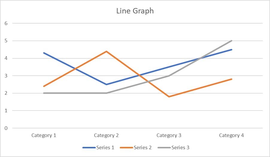
Use Cases in Business Statistics: Line graphs are also used to represent and compare data changes over time, such as stock prices, sales, or website visitor hits.
Example: A line graph which represents monthly website traffic for one year makes it easier to analyze those times when the traffic is high.
Description: Scatter plots show dots that represent the values of 2 different variables. Dots on a scatter plot defines the relation between the variables and how they are correlated to each other.

Use Cases in Business Statistics: It is mainly used to find correlations such as money spent on marketing activities vs revenue.
Example: A scatter plot between marketing activities and revenue showcases the effectiveness of marketing campaign.
Description: Box plots are the types of plot that summarizes a data in terms of summary statistics: minimum, first quartile, median, third quartile, and maximum.

Use Cases in Business Statistics: They help in determining outliers, the spread of data as well as detecting any skewed data.
Example: One can use a box plot to represent the sales performance across different regions.
Description: It is also similar to the line graph though it has an added feature whereby the space between lines and axis is filled by colors.

Use Cases in Business Statistics: Area charts are useful for displaying the cumulative data and can be used to demonstrate, for instance, company’s revenue increases over a period of years.
Example: An example of using area chart is to display the total sales for a period of one year with the cumulative sales representing total sales volume.
Description: Heat map is a matrix display of data for which the value of each cell is represented by the color gradients. They work best for presenting intensity of data values on a single chart.

Use Cases in Business Statistics: Heat maps are great tools for depicting the density of data, for instance, clients’ satisfaction ratings regarding the delivered services.
Example: A heat map of the customer satisfaction rating for the company’s various service zones is helpful in determining a region that requires attention.
Description: Bubble charts are a variation of scatter plots with an added dimension: the size of the bubble represents a third variable.

Use Cases in Business Statistics: Bubble charts are great for complex data visualization, such as comparing product sales, profit margins, and market share simultaneously.
Example: A bubble chart comparing product sales volume, profit margin, and market share of multiple companies provides a comprehensive market overview. The position of bubbles showcasing the sales and profitability and size of bubble representing market share.
Description: Gantt charts are used for project management, showing the schedule of tasks or events over time.

Use Cases in Business Statistics: Gantt charts are useful for planning and tracking project progress, resource allocation, and task dependencies.
Example: A Gantt chart outlining the timeline for a product launch includes tasks, deadlines, and dependencies, ensuring project stays on track.
Our primary service comprises of business statistics assignment help for those students who need a one-on-one assistance to deal with diverse problems in statistics and data analysis. All our services are customer-focussed with a one to one approach to meet the expectation of our clients. Our services include:
Business statistics data are much easier to understand when you convert them into a graphical representation. They not only present a clear picture of complex data but also enhance the quality and appearance of statistical analysis. Students must use these ten best graphical representations based on nature of data to curate data analysis reports that are visually appealing and engaging. If you are struggling while doing your business statistics assignments or if you require help in analyzing and even presenting the data visually, do not hesitate to contact us. Our team of academic writing experts are here to assist you to meet all your academic needs. Contact us now to gain more insights about the services and provide us with an opportunity to be your partner in achieving your academic goals.
Textbooks:
Software Tools:
1. What is the best graphical representation for showing distribution?
Histograms are usually the most suitable mode of data presentation as they display the frequency of the data within a particular interval.
2. How can I choose the right chart for my data?
Choosing the right graph depends on the nature of your data and what you want to present. Bar graphs are applicable when you have to compare values, line graphs when analysing trends, and scatter plots when finding correlations.
3. Are there any tools that can help me create these charts easily?
Yes, such tools as Microsoft Excel, Tableau, or RStudio are also good for creating a large variety of charts and graphs.
4. What are some common mistakes to avoid when creating charts?
Do not overload your chart with multiple information. Refrain from using improper scales and leaving your axes unlabelled.
5. What types of statistical problems can you help with?
Our assistance covers all kinds of statistical questions and problems such as linear regression, hypothesis testing, analysis of variance, data visualization, and others.
6. How do you ensure the originality of the solutions?
We employ plagiarism checking software such as Turnitin to make sure every assignment we produce has no scope of plagiarism or AI-generated content.
Sign up for free and get instant discount of 12% on your first order
Coupon: SHD12FIRST